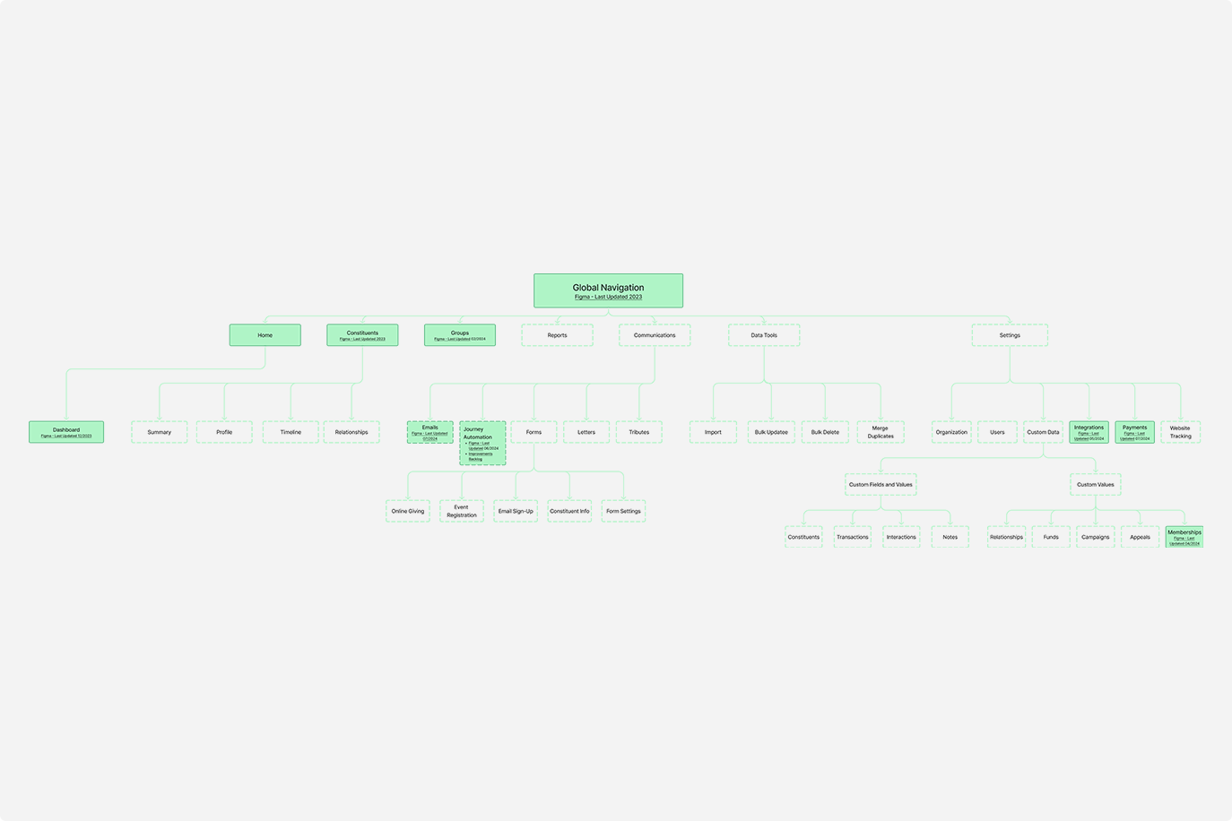
Global Navigation
My role: Designer, Design Manager
Platform: Bloomerang CRM
Overview
Our customers faced challenges with usability due to a cluttered and unintuitive navigation structure. Users struggled to find key features, leading to confusion and decreased adoption of core functionalities. This case study outlines the process of restructuring the CRM’s information architecture to enhance navigation, improve discoverability, and create a more intuitive user experience.
Problem Statement
User research identified several key issues with the existing navigation, including feature overload due to an excessive number of top-level items, which created cognitive strain. Users struggled with unclear labels and ambiguous categorization, making it hard to find essential features. Important tools were often buried under multiple layers, leading to low feature discovery and underutilization. Additionally, inefficient workflows required too many clicks, reducing productivity and increasing frustration.
Research & Discovery
To understand user needs and pain points, we conducted:
User Interviews
We interviewed 15 CRM users to identify navigation pain points.
1.
Advanced features such as Custom Forms and Integrations should be accessible but not overemphasized.
Analytics
Analyzed user behavior data to determine which features were frequently accessed and where users experienced drop-offs.
2.
Users prefer more thoughtful categorization to group related features.
Testing
Conducted card sorting and tree testing sessions to assess users’ mental models and ideal feature groupings.
Key Insights
Users expect core functionalities like Constituents and Reports to be surfaced prominently in the navigation.
3.
Consistent terminology and iconography improve ease of use.
Design Process
Information Architecture Restructuring
We streamlined the global navigation by reducing top-level items from 15 to 7, making it more intuitive and user-friendly. Related features were grouped into clear, logical categories, ensuring a more organized structure. Prioritization of key features and hierarchy was guided by usage data, enhancing accessibility to the most frequently used functions.
Prototyping
We developed interactive prototypes to validate the proposed information architecture and navigation structures with real users. These prototypes allowed us to simulate the user experience, gather valuable feedback, and identify pain points early in the design process. Through iterative testing and refinement, we ensured that the final structure was intuitive, efficient, and aligned with user needs and expectations.
Usability Testing
We conducted A/B testing with two variations of the new navigation to evaluate their effectiveness and user preference. Key metrics like time-to-task completion and user satisfaction scores were measured to assess performance. Using both qualitative insights and quantitative data, we refined the navigation structure to improve clarity, efficiency, and overall user experience.
Solution
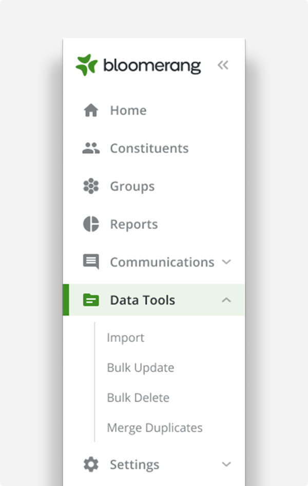
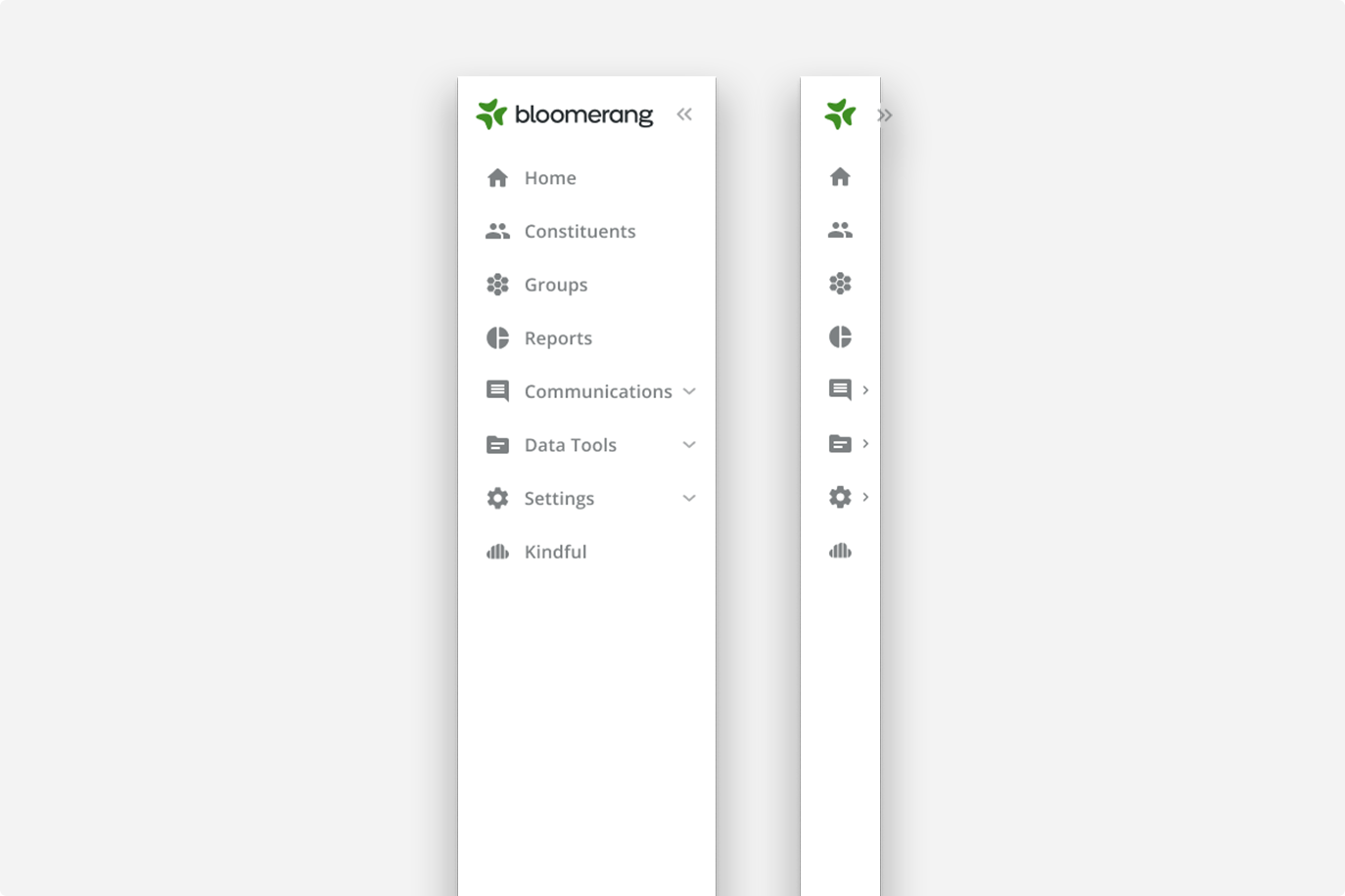
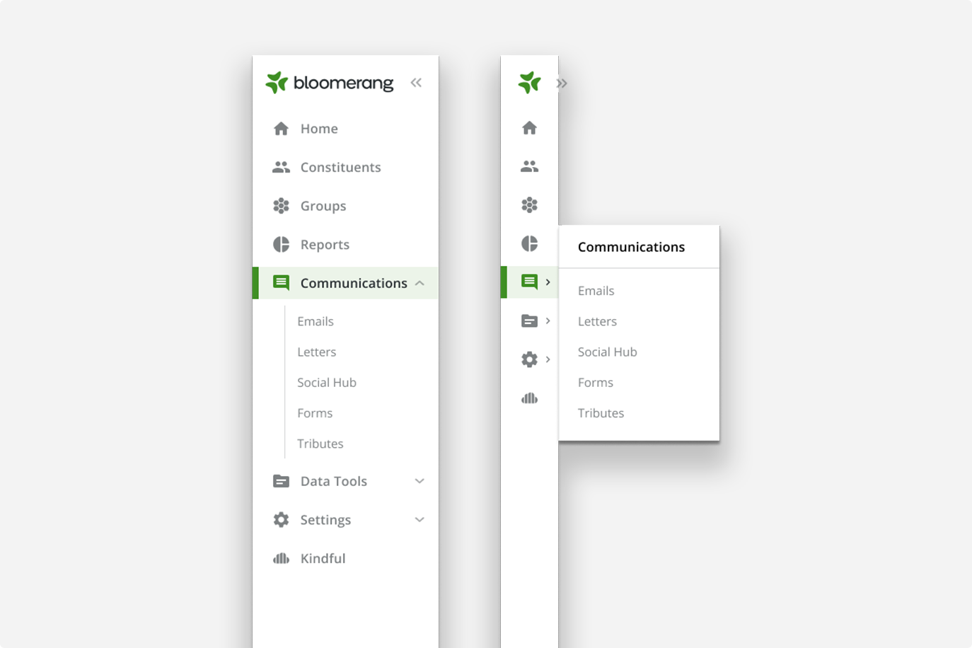
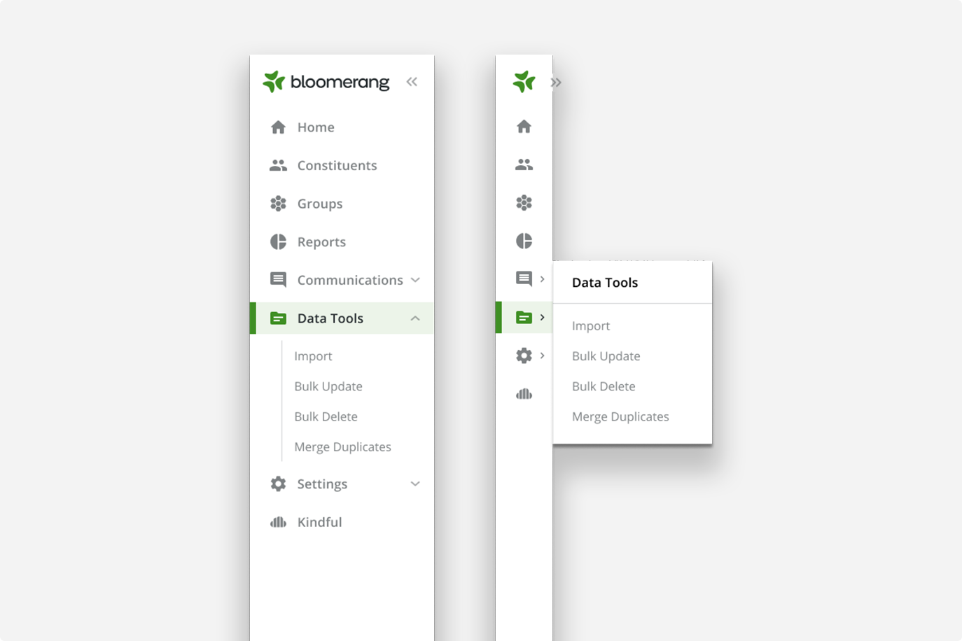
A recategorized lefthand nav structure that included a primary level with an expandable secondary level and tab options for a tertiary solution.
Added collapsable functionality to reduce the nav to a narrow, icon only, format to increase screen real estate for the user.
Consistent and intuitive iconography to aid quick recognition.
Impact & Benefits
36% Reduction in task completion time for common workflows.
41% Increase in feature adoption for Bulk Imports and Integrations.
Higher user satisfaction with a significant Net Promoter Score improvement.
Fewer support tickets related to navigation confusion.

Conclusion
Restructuring the information architecture of the CRM significantly improved usability and feature discoverability. By focusing on a user-centric approach, leveraging research insights, and validating with testing, we successfully enhanced the overall experience, leading to greater efficiency and adoption of the platform.